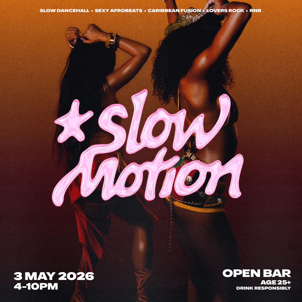
Slow Motion
Event Brand Identity & Creative Direction
Slow Motion was born out of a simple observation: London's nightlife wasn't really serving the slower side of Black music. Slow dancehall, lovers rock, Afrobeats at its most intimate, R&B you actually feel. Founders Benjamin and Jebu set out to change that, and brought me in to collaboratively build the visual world around it.
Concept
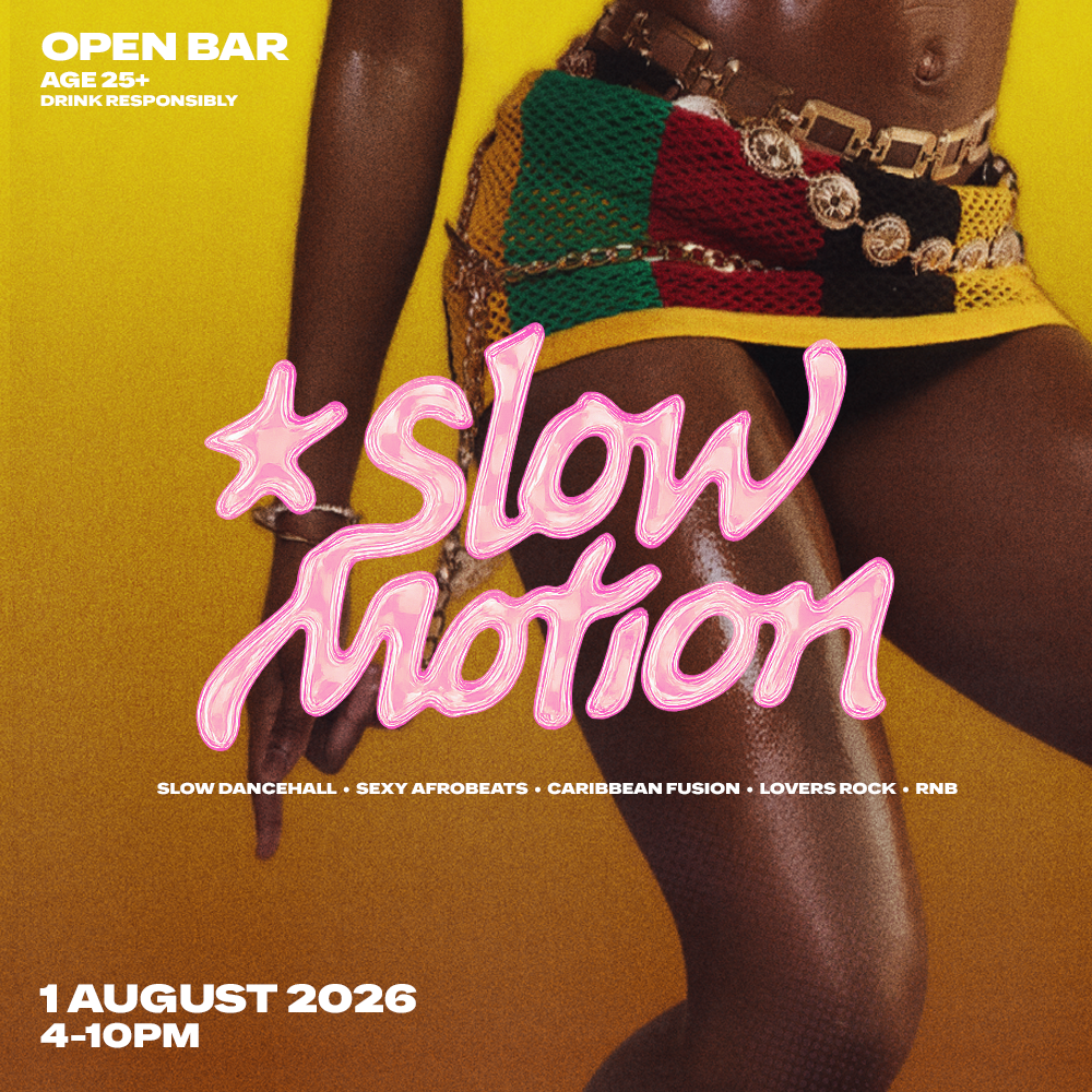
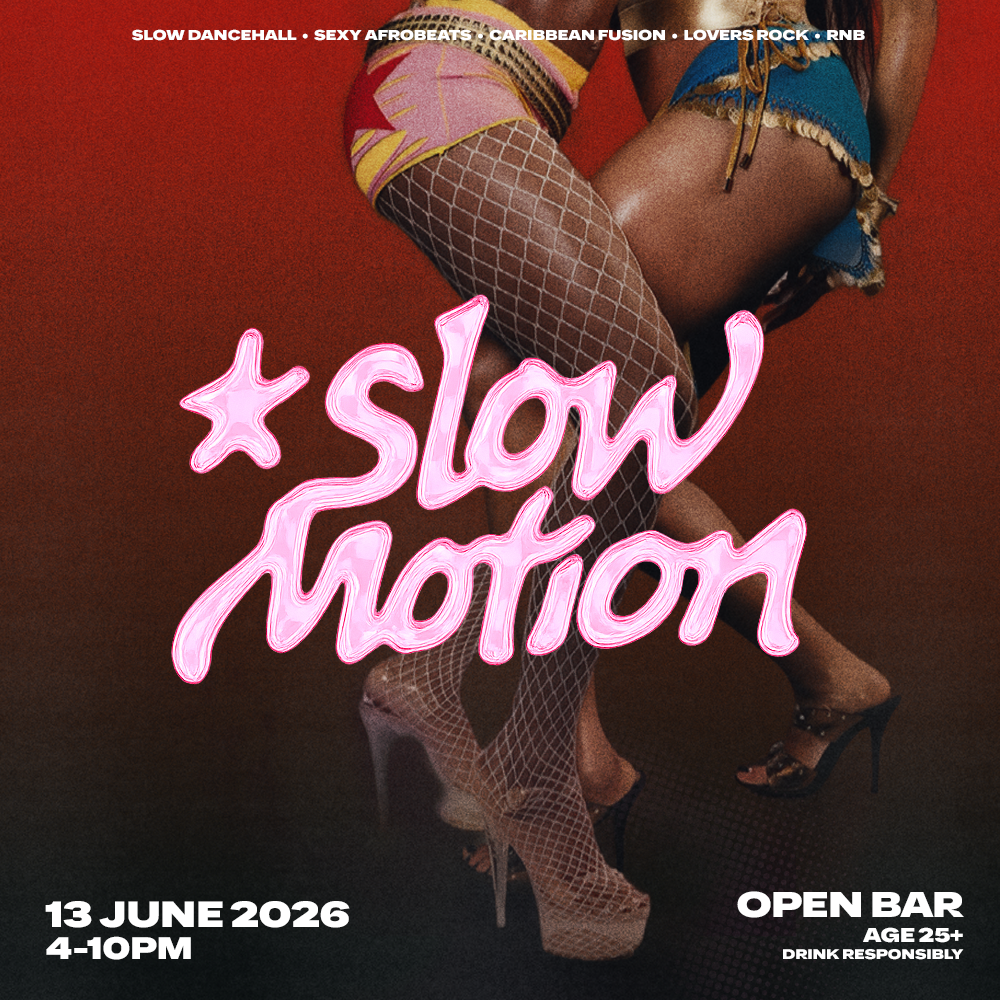
The brief was to make people feel the event before they'd ever been. Not just a flyer, but a visual language that carried the mood of the night itself. Sensual, confident, unapologetically London. An event identity that felt less like nightlife promotion and more like fashion editorial.
Creative Decisions
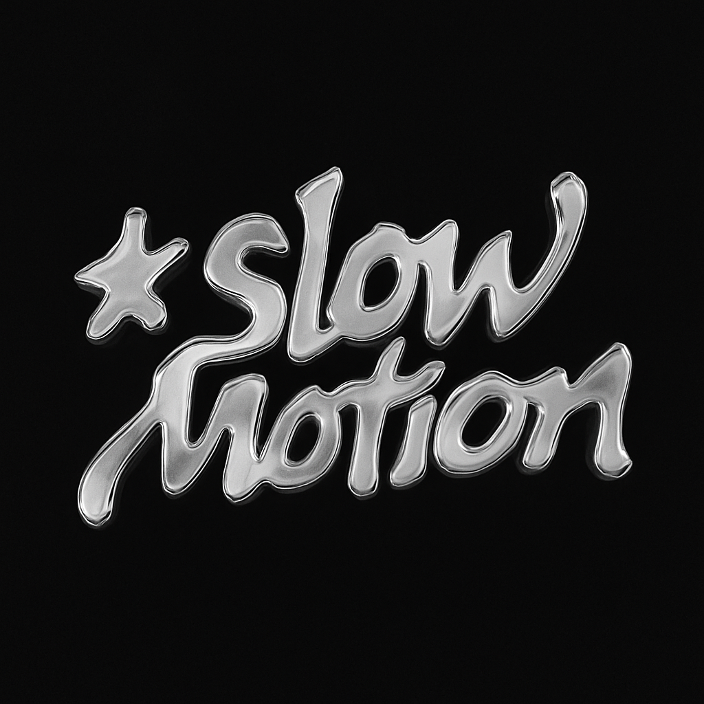
The identity is built around consistency and contrast. Each poster shifts dramatically in colour and atmosphere, gold, deep red, electric blue, but the brand holds together through a custom logo, a unified typographic system, and an ongoing creative collaboration with photographer Tallulah, whose body-forward imagery gives Slow Motion a visual signature that most independent events never find.
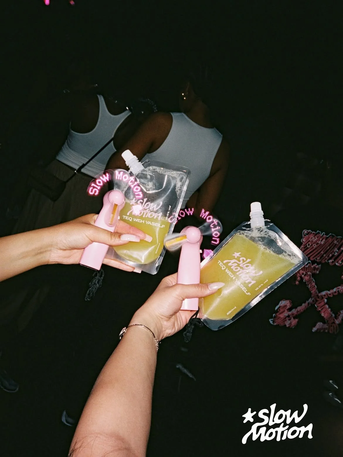
The identity has extended across every touchpoint. Branded merchandise including custom fans, a signature drink “Teq Weh Yaself”, and a suite of social media adverts produced for each event, all carrying the same visual language and ensuring the brand lives consistently beyond the poster.
Five events in, Slow Motion has built a genuine following and is now attracting the attention of major cultural partners.